
The USPS® recently published a guide, “Best Practices for Imitation Markings and Trademarks.” Designed to help mailers with the creation of a mailstream-approved mailpiece, it reviews acceptable practices for designs, wording and images to avoid problems in respect to USPS packaging, trademarks, products and services.
Mailpiece Designs
In general, designs used on the mailpiece should adhere to USPS standards as outlined in the Domestic Mail Manual.
Postage Design Guidelines
Designs that are similar to a USPS logo or postage stamp must be USPS-approved and licensed prior to use. A design placed near the postage area must allow visible, clear space between it and the left edge of the postage. This includes at least one-half inch of clear space to the left of the postage area in the event the indicia is not enclosed.
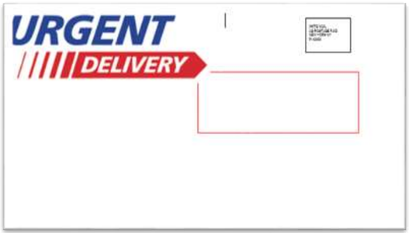
Envelope Design Guidelines
Colors, color schemes and formats used in your design may be deemed objectionable if they mimic USPS designs for logos or services. Consult a Mailpiece Design Analyst should you have questions on acceptable design components.
In the example below from the guide, the envelope violates both USPS logo and services guidelines. By featuring the text “Urgent Delivery” in capitalized, bold, italicized red and blue lettering, it too closely resembles the USPS logo for Priority Mail®, and implies a level of service as prohibited in the Domestic Mail Manual. See the guide for more examples of unacceptable designs.
Mailpiece Wording
Wording used to describe USPS trademarks and services cannot be used on the mailpiece. In addition to the Priority Mail logo example above, other unacceptable use of trademarked services includes First-Class® Mail, Firstclass®, Priority Mail® and Priority Mail Express®. Unacceptable use of non-trademarked services includes terms such as Letter Pak, Air Gram, Express Delivery, Next Day and Priority among others.
Additionally, wording that features time and date markings, invalid or unauthorized endorsement regarding the treatment of mail and special instructions to the USPS on the acceptance or delivery of the mailpiece are not permissible.
Again, consult a Mailpiece Design Analyst should you have questions on acceptable wording.
Mailpiece Images
The USPS declares that several images are unaccecptable to use on a mailpiece:
- Faux Postage Stamps – Images that look like stamps are not acceptable because they can be confused with actual postage.
- Postage Markings – Likewise, images similar to USPS postage markings are not acceptable because they can be confused with valid postage.
- Cancellation Marks and Faux Postmarks – These two things are not acceptable because they give the false impression the mailpiece was cancelled by the USPS.
- Faux barcodes – The USPS scans the Intelligent Mail® barcode when processing a mailpiece into the mailstream. A faux barcode could be mistaken for an actual, working barcode and scanned without the supporting information needed for the mailpiece to travel in the mailstream. Note: A faux barcode is permissible on the non-address side, if the symbology is different from USPS barcodes.
- Elements Mimicking Label Designs – Addresses in label formats are unacceptable if they mimic expedited packaging labels.
- Government/Federal Agency Images – Government and federal agency images are unacceptable because they indicate the mailpiece is a government or federally issued communication.
Contact Tension
Design your mailpiece with confidence. Tension sales teams are Postal Partner Certified and can help you best navigate the do’s and don’ts for your mailpiece design. Contact us today to get started.